


Artist note
탈모던의 해체론적 사유가 지배하는 동시대 미술에서도 기하학적 형태는 여전히 감성이 배제된 이성적 코드로 인식되곤 한다. 그러나 기하학적 조형은 인간과 문화의 보편적 시각언어이자 동시대의 핵심 문화 코드이다. 이러한 관점에서 나는 기하학적 조형을 반순수주의(Anti-purism) 및 반정초주의(anti-foundationalism) 속성을 지닌 형식으로 재구조화하고자 했다. 고착된 이성적 코드를 해제하여 유희와 재미를 통해 의미를 공유하는 새로운 감성 코드로 재맥락화하는 것, 이것이 내가 작업을 통해 구현하고자 하는 기하학적 조형의 새로운 탐색이다.
Even within contemporary art, where postmodern deconstructive thought has exerted a strong influence, geometric form is still often perceived as a rational code devoid of emotion. Yet geometric form is not only a universal visual language shared by people across cultures, but also a key cultural code of the contemporary era.
From this perspective, I have sought to restructure geometric form as a mode of expression informed by anti-purism and anti-foundationalism. By dismantling the fixed rational codes traditionally associated with geometry, I aim to recontextualize it as a new affective code through which meaning can be shared through play and enjoyment.
This recontextualization—from a fixed rational code to a new affective code grounded in play and enjoyment—constitutes my ongoing exploration of new possibilities for geometric form through my artistic practice.
About
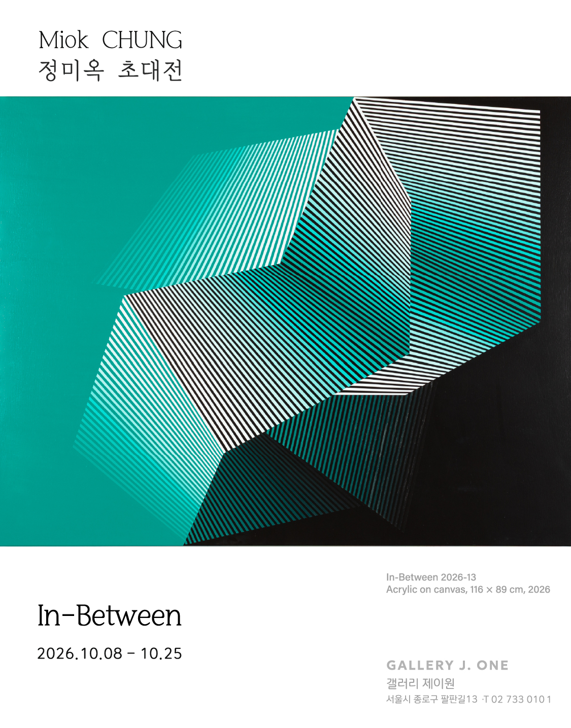
정미옥의 작품을 처음 바라보면 가장 먼저 눈에 들어오는 것은 선명한 색과 반복되는 선, 그리고 반듯하게 이어지는 기하학적 형태들이다. 직선과 사선, 줄무늬와 색면이 화면 안에서 서로 만나고 겹치면서 단순해 보이던 형태들은 조금씩 다른 모습을 만들어낸다. 어떤 부분은 앞으로 튀어나오는 듯하고, 어떤 부분은 화면 깊숙이 들어가는 것처럼 느껴진다. 가만히 멈춰 있는 평면인데도 시선을 옮길 때마다 형태가 흔들리거나 움직이는 듯 보이기도 한다. 작가는 이렇게 우리의 눈이 순간적으로 착각하게 되는 경험을 이용해 평범한 기하학적 형태를 낯설고 흥미로운 장면으로 변화시킨다.
작가가 사용하는 선과 사각형, 줄무늬와 반복되는 무늬들은 사실 미술의 역사에서 오래전부터 사용되어 온 익숙한 조형 요소들이다. 정미옥은 완전히 새로운 모양을 만들어내기보다는 이미 존재해 온 기하학적 형태들을 가져와 다시 섞고, 자르고, 겹치고, 새로운 순서로 배열한다. 같은 줄무늬라도 방향을 조금 바꾸거나 색을 다르게 하고, 서로 다른 형태 위에 겹쳐 놓으면 전혀 다른 느낌이 만들어진다. 마치 이미 알고 있는 단어들을 새롭게 배열해 이전에는 없던 문장을 만드는 것과 비슷하다. 작가에게 화면은 여러 기하학적 언어들이 만나 서로 영향을 주고받는 하나의 넓고 자유로운 공간이라고 할 수 있다.
이 과정에서 특히 중요한 것은 ‘환영(Illusion)’이다. 여기서 환영은 실제로 존재하지 않는 것이 눈앞에 있는 것처럼 느껴지는 시각적인 착각을 뜻한다. 정미옥의 작품은 평평한 화면 위에 만들어졌지만, 색의 차이와 선의 방향, 형태가 겹쳐지는 방식에 따라 화면 안에 깊은 공간이 생긴 것처럼 보이기도 한다. 어떤 선들은 빠르게 앞으로 달려오는 것 같고, 어떤 색면은 뒤쪽으로 조용히 물러나는 것처럼 느껴진다. 가까이에서 볼 때와 멀리서 볼 때의 인상이 다르고, 보는 위치에 따라서도 화면의 리듬과 깊이가 조금씩 달라진다. 이 때문에 관람자는 작품 앞에 멈춰 서 있기보다 자연스럽게 시선을 움직이며 화면 곳곳을 탐색하게 된다.
정미옥은 이러한 시각적 착각을 단순한 기술이나 장식으로만 사용하지 않는다. 작가에게 또 하나의 중요한 개념은 ‘유희(Play)’이다. 유희란 어렵게 생각하지 않아도 된다. 우리가 놀이를 하면서 예상하지 못했던 것을 발견하고 즐거움을 느끼는 것처럼, 작가는 관람자가 작품을 보면서 형태와 색의 변화를 발견하고, 자신의 눈이 만들어내는 착각을 즐기기를 바란다. 그래서 그의 작품에서는 매우 반듯하고 정확한 기하학적 형태가 사용되지만, 전체적인 인상은 꼭 차갑거나 엄격하지만은 않다. 밝고 경쾌한 색이 서로 부딪히고, 반복되는 선들이 리드미컬하게 이어지면서 화면에는 생동감 있고 장난스러운 긴장감이 생겨난다.
우리는 흔히 기하학이라고 하면 수학 시간의 도형이나 정확한 계산을 떠올린다. 그래서 기하학적 미술 역시 차갑고 이성적이며 감정이 없는 작품이라고 생각하기 쉽다. 그러나 정미옥은 바로 이러한 생각을 바꾸고자 한다. 작가에게 기하학은 단단하게 굳어 있는 규칙이 아니라 얼마든지 변화할 수 있는 유연한 시각언어이다. 같은 형태라도 어떤 색을 사용하고, 어느 방향으로 배열하며, 무엇과 겹치느냐에 따라 밝고 유쾌해질 수도 있고, 긴장되거나 신비롭게 느껴질 수도 있다. 엄격해 보이는 직선과 사각형도 작가의 손을 거치면 움직임과 리듬, 즐거움과 감정을 품은 형태로 다시 태어난다.
작가가 말하는 ‘반순수주의(Anti-purism)’와 ‘반정초주의(Anti-foundationalism)’ 역시 이러한 생각과 연결된다. 어렵게 들리는 말이지만, 쉽게 풀어 말하면 “기하학은 반드시 한 가지 규칙과 방식만을 따라야 한다”는 생각에서 벗어나겠다는 뜻이다. 작가는 기존의 형식을 그대로 지키기보다 서로 다른 요소들을 자유롭게 섞고 변형한다. 하나의 정답을 찾기보다 여러 가능성을 열어두는 것이다. 작품 속에서 선과 색, 형태가 끊임없이 만나고 헤어지는 모습은 이러한 태도를 잘 보여준다.
결국 정미옥의 작품에서 중요한 것은 완벽하고 정확한 도형 자체가 아니다. 그 형태들이 서로 만나면서 만들어내는 변화와 움직임, 그리고 그것을 바라보는 우리의 경험이 더 중요하다. 관람자는 작품 앞에서 “왜 이 부분은 앞으로 나온 것처럼 보일까?”, “왜 이 선들은 움직이는 것처럼 느껴질까?”와 같은 작은 질문을 떠올릴 수 있다. 바로 그 순간 작품은 더 이상 차갑고 어려운 기하학적 그림이 아니라, 우리의 눈과 감각이 함께 참여하는 생생한 놀이의 공간이 된다. 정미옥은 익숙한 기하학의 질서를 흔들고 다시 조합함으로써, 딱딱하게만 보였던 형태 속에서도 풍부한 감정과 움직임, 흥미로운 시각적 즐거움을 발견할 수 있다는 것을 보여준다.
When we first encounter CHUNG Miok’s work, what immediately draws our attention are vivid colors, repeated lines, and precisely arranged geometric forms. Straight lines, diagonals, stripes, and blocks of color meet and overlap across the surface, causing simple shapes to gradually take on new appearances. Some areas seem to project forward, while others appear to recede deep into the picture. Although the work itself is physically still and flat, the forms may seem to tremble, shift, or move as our eyes travel across the surface. Through these subtle visual effects, CHUNG transforms familiar geometric forms into unfamiliar, lively, and intriguing visual configurations.
The lines, squares, stripes, and repeated patterns in her work are familiar elements that have long appeared throughout the history of art. Rather than inventing entirely new forms, CHUNG takes existing geometric languages and rearranges them by combining, cutting, overlapping, and placing them in new sequences. Even the same stripe can create a completely different impression when its direction changes, its color shifts, or it is layered over another shape. It is similar to creating a new sentence by rearranging words we already know. For CHUNG, the pictorial surface becomes an open and flexible space where different geometric languages meet and influence one another.
One of the most important ideas in this process is “illusion.” Here, illusion refers to the visual experience of perceiving something that is not actually present. Although CHUNG’s works are made on flat surfaces, differences in color, the direction of lines, and the ways in which shapes overlap can create a sense of depth and spatial extension. Some lines seem to rush forward, while certain areas of color appear to recede quietly into the background. The work may look different when viewed from nearby or from a distance, and its sense of rhythm and depth can also shift depending on where the viewer stands. As a result, viewers are naturally encouraged to move their gaze across the work and explore its many visual details.
For CHUNG, however, illusion is not simply a technical effect or a decorative device. Another central idea in her work is “play.” Play does not need to be understood as a complicated concept. Just as we discover unexpected things and experience enjoyment while playing, CHUNG invites viewers to notice changes in form and color and to enjoy the subtle visual surprises produced by their own perception. Her works are composed of precise and orderly geometric forms, yet the overall impression is not necessarily cold or rigid. Bright, lively colors interact and collide, while repeated lines create a rhythmic flow, giving the work a sense of energy, movement, and playful tension.
When we think of geometry, we often imagine mathematical shapes, measurements, and precise calculations. For this reason, geometric art can easily be understood as cold, rational, or lacking in emotion. CHUNG challenges this familiar assumption. For her, geometry is not a fixed system governed by strict rules, but a flexible visual language capable of constant transformation. The same form can feel cheerful, tense, mysterious, or dynamic depending on its color, direction, arrangement, and relationship to other forms. In her work, even rigid straight lines and rectangles can be transformed into forms filled with rhythm, movement, pleasure, and emotion.
The ideas of “anti-purism” and “anti-foundationalism” that inform CHUNG’s practice are closely connected to this approach. Although these terms may sound difficult, they can be understood quite simply: the artist seeks to move away from the idea that geometry must follow a single fixed rule or method. Instead of preserving established forms exactly as they are, she freely combines and transforms different elements. Rather than searching for one correct answer, she opens the work to multiple possibilities. The way lines, colors, and forms continuously meet, separate, overlap, and change across the surface reflects this open and flexible attitude.
Ultimately, what matters most in CHUNG Miok’s work is not the perfection or precision of geometric shapes themselves, but the changes, movements, and visual experiences created through their relationships. Standing before the work, viewers may find themselves asking, “Why does this part seem to come forward?” or “Why do these lines feel as if they are moving?” At that moment, the work is no longer simply a difficult or distant geometric composition. It becomes a vivid space of play in which our eyes and senses actively participate. By unsettling and rearranging familiar geometric order, CHUNG shows us that even the most rigid-looking forms can contain rich emotion, movement, and unexpected visual pleasure.
Works
In-Between 2026-13
In-Between 2026-13 91x117cm (50F) Acrylic on canvas 2026
In-Between 2026-13In-Between 2026-13 91x117cm (50F) Acrylic on canvas 2026
In-Between 2026-11
91x117cm (50F) Acrylic on canvas 2026
In-Between 2026-11 91x117cm (50F) Acrylic on canvas 2026
In-Between 2026-8
73x53cm (20P) Acrylic on canvas 2026
In-Between 2026-873x53cm (20P) Acrylic on canvas 2026
In-Between 2026-5
73x91cm, 30F Acrylic on canvas 2026
In-Between 2026-573x91cm, 30F Acrylic on canvas 2026
In-Between 2026-4
73x91cm (30F) Acrylic on canvas 2026
In-Between 2026-473x91cm (30F) Acrylic on canvas 2026
In-Between 2026-9
Acrylic on canvas, 91x65cm(30F), 2026
In-Between 2026-9Acrylic on canvas, 91x65cm(30F), 2026
In-Between 2026-3
73x91cm (30F) Acrylic on canvas 2026
In-Between 2026-373x91cm (30F) Acrylic on canvas 2026
Exhibition View
Artist
